
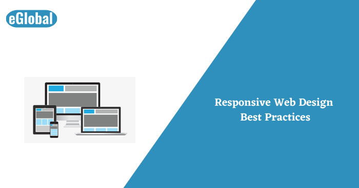
Responsive web design is a web development approach that creates effective changes to the looks of a website, depending on the size of the screen and the type of the device used to view it. responsive web design is one way to address the problem of designing for multiple devices available to all the customers, ranging from tiny phones to huge desktop monitors.
In 2021, the number of global smartphone users is projected to be a total of 3.5 billion, which is 9.3% more than 2020.96% of Americans now own a cellphone of some variety, with 84% of those cell phones being smartphones. People have now started to browse the web on their phones as opposed to sitting down at their desktop or laptop computer.
Every one of us is already mobile-optimizing our websites, but that doesn’t mean what we have is meeting your users’ needs.
Constrained by size, mobile devices don’t offer the most real estate to work the content and imagery. When you think of a website page, there is a desire to break the information that we need to display in sections. This way one can easily able to break down and read each part without any confusion.
Your business website very likely has a particular call-to-action that you want your users to complete. To make people complete this goal, you must have a main call-to-action feature in your navigation,and at the bottom of your site, especially on desktop.
If you’re tracking your CTAs, you’ll notice that your navigation button is one of the only ways where people make it to that gateway page so they would convert
SVGs or Scalable Vector Graphics are a necessity for any responsive design that is using illustrations or icons. Unlike image files, SVGs are very much scalable. Any icon or graphic shall remain ultra-sharp without having to worry about resolution or pixelation.This results in a really polished look no matter how the site is seen.
Furthermore, SVGs have a small file size, which helps the site load way faster. No one wants to sit on their phone and have an image buffer because of how huge the file size is.
On cell phones, buttons and links will be clicked by a finger and not by a mouse click, therefore, interactive areas on the screens need to have a larger area to accommodate the difference. It’s required that any tappable element on a cell phone be at least 48 pixels in height.You will most definitely need to optimize the buttons, form inputs, inline links on blogs, card layouts, navigation links and more.
This will help to be sure that there are fewer errors in navigation through the site, in turn minimizing potential frustration, and keeping the viewer engaged.
All different devices need images of different sizes.A desktop page may happen to need an image 1200px wide, while the mobile version of the very same page may only need that image at 400px wide.For the most responsive experience, it’s good to use two different versions of one image for mobile and desktop.
It’s essential to make sure of the legibility of your site all across platforms and different variety of devices, but through mobile, you will need to be a lot more attentive to your users’ readability needs. If people can’t read your proposition or your content, they likely won’t stick around.You want to make sure the content is simple to read and optimized for the device size so readers aren’t left squinting.
This means taking note of all the typefaces you would like to use on your site and making sure whether they’d make for good or bad legibility on small screens.
While using smartphones, you gain the ability to do many diverse tasks. You make calls send messages, and open apps, all from the browser.Taking advantage of these abilities on your website will not only enhance the mobile experience for users but will also increase conversions and encourage action.This idea can be applied to all email addresses, opening new messages in an email app, etc.
Social media icons can be coded in ways that, when clicked, will open directly in the app.All this can make it easier for your patrons to connect and communicate with you.
In 2022, all of this is compulsory if you need to have an optimized website for your patrons. It’s a great possibility that half of the website’s traffic is coming from the mobile itself but it is not an option to abandon them after giving them a less than okay mobile experience.
By making these edits on your site using these responsive design best practices in mind, you’ll be able to determine if your site is fit for today or if you need to make some changes.
Hope this Article was useful for you. hire Indian developers for your future projects! contact us now & get free quotation…….

Jul 1, 2026

Jun 30, 2026

Jun 29, 2026

© 2017 All rights reserved.